](https://deep-paper.org/en/paper/2407.10385/images/cover.png)
Large Language Models (LLMs) like GPT-4 have conquered the world of text. They can write poetry, debug code, and summarize history. However, the physical world doesn’t always speak in words; it speaks in sensor data.
From the accelerometer in your smartwatch tracking your steps to the electrocardiogram (ECG) monitoring a patient’s heart rhythm, ubiquitous sensing generates massive streams of numerical data. The traditional way to use this data with AI is to feed the raw numbers directly into the model. But if you’ve ever tried to read a spreadsheet with 10,000 rows of floating-point numbers, you know the problem: it is overwhelming, expensive to process, and hard to interpret.
In this post, we are breaking down a fascinating paper titled “By My Eyes”, which proposes a paradigm shift. Instead of forcing LLMs to read raw numbers, what if we let Multimodal LLMs (MLLMs) “look” at the data as images?
The Problem: The “Wall of Numbers”
To understand why this research is necessary, we first need to look at how LLMs handle numerical sequences. Until recently, if you wanted an LLM to classify a user’s activity (e.g., “walking” vs. “running”) based on sensor data, you had to convert that data into a text prompt.
Imagine taking a sensor reading sampled at 100Hz (100 times per second). Just one minute of data results in thousands of numbers. Feeding this into an LLM creates two major issues:
- The Token Tax: LLMs charge by the “token.” A minute of raw sensor data can easily consume 90,000 tokens. This is not only incredibly slow but financially ruinous for practical applications.
- The Context Limit: LLMs have limited “context windows.” If the input data is too long, the model “forgets” the beginning of the sequence or hallucinates.
The researchers empirically tested this limitation. They asked GPT-4o to perform simple arithmetic (calculating a mean) and pattern recognition on sequences of varying lengths.
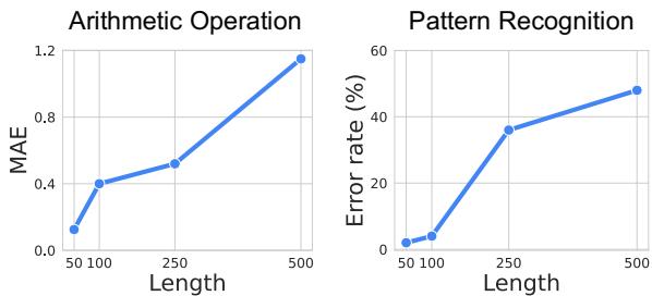
As shown in Figure 2 above, the model’s performance collapses as the sequence length increases. For pattern recognition (the graph on the right), once the sequence passes a few hundred numbers, the error rate skyrockets. The model effectively starts guessing.
The Visual Solution
The researchers propose a method called Visual Prompting. Instead of text, they convert the sensor data into a visual plot (an image) and feed it to an MLLM (like GPT-4o), which is trained to understand both text and images.
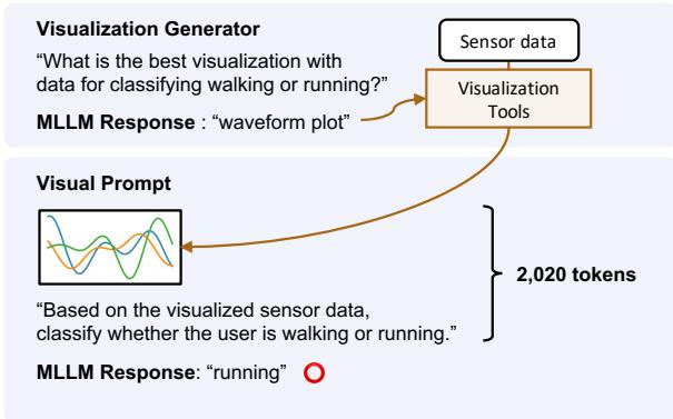
Figure 1 highlights the stark difference.
- The Baseline (Text): A prompt stuffed with raw numbers (
[0.65, 0.62, ...]). It costs nearly 53,000 tokens and, in this example, leads to the wrong answer (“walking”). - The Proposed Method (Visual): The data is converted into a waveform plot. The MLLM looks at the shape of the wave, uses only 2,020 tokens, and correctly identifies the activity as “running.”
This shift reduces token usage by over 15 times while improving accuracy. But there is a catch: simply plotting a line graph isn’t always enough. Different sensors require different types of visualizations. This brings us to the paper’s core innovation.
The Core Method: The Visualization Generator
If you are a signal processing expert, you know that an accelerometer signal looks best as a waveform, but an audio signal might need a spectrogram (a visual representation of frequencies). An MLLM doesn’t inherently know which visualization is best for a specific, unseen task.
To solve this, the authors developed a Visualization Generator. This system automates the creation of the optimal chart without needing a human expert. It works in two phases:
Phase 1: Visualization Tool Filtering
First, the system presents the MLLM with a “menu” of available plotting tools (from libraries like Matplotlib or SciPy) and a description of the task (e.g., “detect arrhythmia from ECG data”).
The MLLM filters this list down to a few likely candidates. For example, if the task involves heart rates, it might select “ECG individual heartbeats” and “Raw Waveform,” but discard “Spectrogram.”
Phase 2: Visualization Selection (Self-Reflection)
This is the clever part. The system generates plots using all the candidate methods identified in Phase 1. It then feeds these images back to the MLLM and asks: “Which of these images makes the pattern easiest to see?”
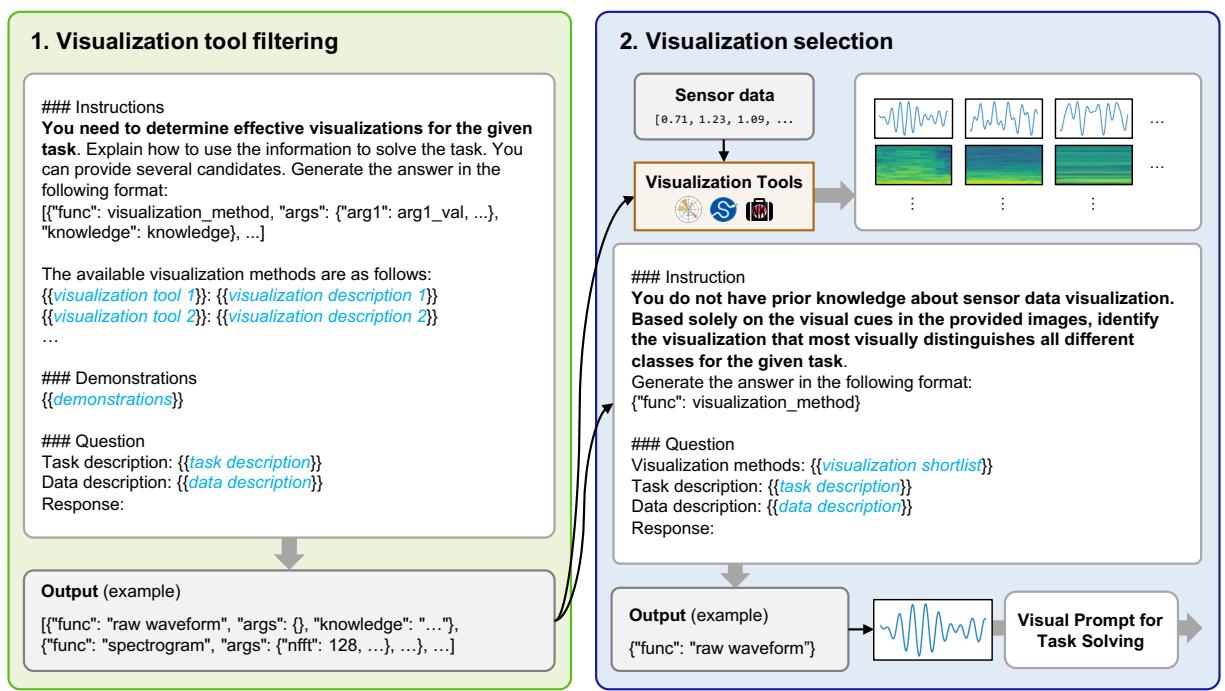
As illustrated in Figure 4, the model acts as its own critic. It might look at a raw waveform and decide it’s too messy, then look at a spectrogram and decide it’s too abstract, finally settling on a specific signal plot that clearly highlights the data features.
Once the best visualization type is selected, the final Visual Prompt is constructed. This prompt includes:
- The Visualized Target Data: The sensor reading we want to classify.
- Few-Shot Examples: Reference images labeled with the correct answer (e.g., an image of a “walking” signal and an image of a “running” signal) to teach the model what to look for.
- Instructions: Text guiding the model on how to interpret the visual.
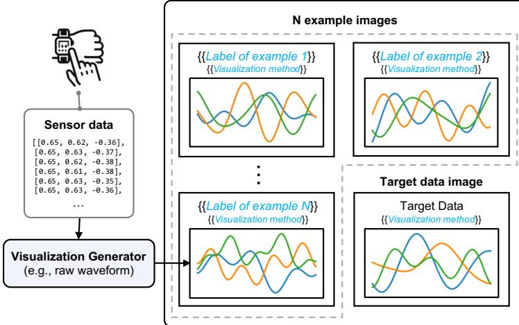
Figure 3 shows the anatomy of this prompt. It combines the efficiency of image processing with the reasoning capabilities of the LLM.
What does the prompt actually look like?
To give you a concrete idea of what the MLLM “sees,” look at the image below. This is a visual prompt for recognizing human activities (HHAR task).
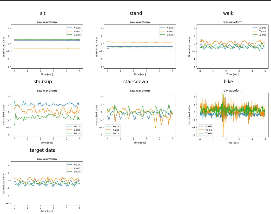
The model is given clear visual examples of sitting, standing, walking, etc., and asked to match the “target data” at the bottom to the most similar visual pattern. This is much more intuitive for a multimodal model than comparing thousands of floating-point numbers.
Experiments & Results
The researchers tested this approach across nine sensory tasks involving four different modalities:
- Accelerometer: Human activity recognition (walking, biking, etc.).
- ECG: Heart arrhythmia detection.
- EMG: Hand gesture recognition (measuring muscle electrical activity).
- Respiration: Stress detection.
They compared their Visual Prompting method against the standard Text-Only prompt (raw numbers) and even supervised learning models trained specifically for these tasks.
1. Accuracy and Efficiency
The results were decisive. Visual prompts outperformed text prompts across almost every category.
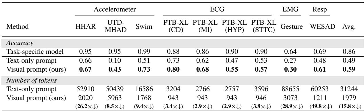
Table 1 (above) summarizes the findings:
- Accuracy: Visual prompts achieved an average of 10% higher accuracy than text prompts. In complex activity recognition (UTD-MHAD), accuracy jumped from 10% (text) to 43% (visual).
- Cost: The token reduction is massive. Text prompts for EMG (muscle) data required over 88,000 tokens per query. The visual equivalent? Just 3,073 tokens. That is nearly a 29x reduction in cost for that specific task.
2. Does the Visualization Strategy Matter?
You might wonder: Can’t we just use a standard line graph for everything? Why do we need the fancy “Visualization Generator”?
The experiments showed that the type of visualization makes a huge difference.
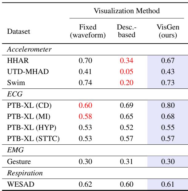
Table 2 compares three approaches:
- Fixed (Waveform): Always using a raw line chart.
- Description-based: Letting the LLM guess the best plot based only on text descriptions (without seeing the data).
- VisGen (Ours): The paper’s method, where the LLM sees the plots and chooses.
Notice the ECG (Heart) tasks in the table. The “Fixed” raw waveform performed poorly (0.60 accuracy). The “VisGen” method scored significantly higher (0.80). Why? Because raw ECG data is noisy and complex.
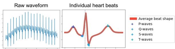
Figure 7 illustrates this perfectly. The “Raw waveform” (left) is just a squiggle. The “Individual heart beats” plot (right)—which the Visualization Generator chose automatically—overlays the heartbeats to show the average shape and marks specific waves (P, Q, S, T). This processed visual makes it much easier for the MLLM to detect irregularities like arrhythmia.
3. Diversity of Solutions
The Visualization Generator proved to be dynamic. It didn’t just pick one type of chart for everything.
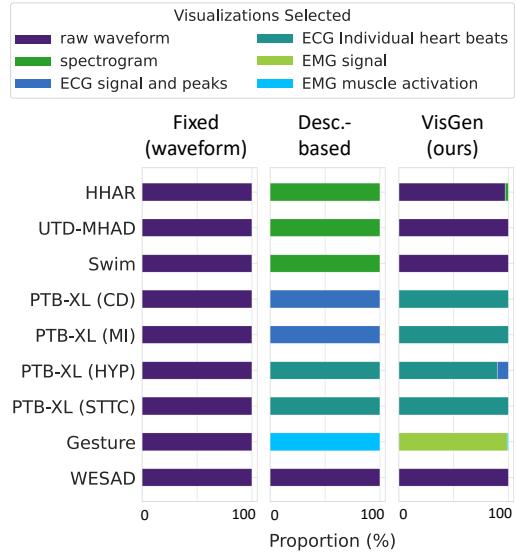
Figure 6 shows the distribution of chosen visualizations. For accelerometers (HHAR), it stuck to raw waveforms. For muscle data (Gesture), it preferred “EMG Signal” plots. For heart data (PTB-XL), it frequently chose “Individual heart beats.” This adaptability is key to the method’s success—it tailors the “lens” through which the AI views the data.
Conclusion and Implications
The “By My Eyes” paper presents a compelling argument for changing how we interface with Multimodal LLMs. By treating sensor data as visual information rather than textual statistics, we can unlock the power of these models for real-world applications like healthcare monitoring and smart devices.
Here are the key takeaways:
- A Picture is Worth 1,000 Numbers: Visual prompts are drastically cheaper (15.8x fewer tokens) and more accurate than text prompts for sensor data.
- Context is King: Visualizing data allows us to bypass the context window limitations that plague text-based analysis of long time-series data.
- Automation is Possible: We don’t need human experts to hand-craft charts for every new sensor. MLLMs are capable of “looking” at options and selecting the best visualization strategy themselves.
As MLLMs continue to improve their vision capabilities, this approach suggests a future where AI agents can intuitively “read” the physical world through charts and graphs, just as a doctor reads an X-ray or an engineer reads a seismograph. It bridges the gap between the digital intelligence of LLMs and the analog reality of our sensors.