](https://deep-paper.org/en/paper/2506.05035/images/cover.png)
Introduction
In the rapidly evolving landscape of Artificial Intelligence, time series data is the lifeblood of critical industries. From monitoring a patient’s vitals in an ICU (healthcare) to predicting power grid fluctuations (energy) or detecting traffic anomalies (transportation), deep learning models are making decisions that affect human safety.
However, these deep neural networks are often “black boxes.” We feed them data, and they spit out a prediction. In high-stakes environments, “it works” isn’t enough; we need to know why it works. This is the domain of Explainable AI (XAI).
For years, researchers have developed methods to attribute importance to specific features in the input data. But a recent paper, TIMING: Temporality-Aware Integrated Gradients for Time Series Explanation, uncovers a significant flaw in how we have been evaluating these methods. It suggests that the metrics we rely on have been inadvertently penalizing methods that understand “direction” (positive vs. negative impact) and favoring methods that only look at magnitude.
In this post, we will deep dive into this research. We will explore why traditional evaluation metrics fail for time series, introduce a new set of metrics that fix this blind spot, and break down TIMING, a novel method that adapts the powerful Integrated Gradients technique specifically for the temporal complexities of time series data.
The Problem with Current XAI Evaluations
To understand the contribution of this paper, we first need to look at the state of feature attribution.
Signed vs. Unsigned Attribution
When a model makes a prediction—say, predicting a high risk of mortality for a patient—different vital signs contribute differently.
- Unsigned Attribution: This approach asks, “How important is this feature?” It gives a magnitude score. High blood pressure might have a score of 0.8, and heart rate might have 0.2. It doesn’t tell you if the feature pushed the risk up or down, just that it mattered.
- Signed Attribution: This asks, “Did this feature increase or decrease the prediction score?” High blood pressure might be +0.8 (increasing risk), while a healthy oxygen level might be -0.5 (decreasing risk).
End-users, like doctors, usually prefer signed attribution. They want to know what is causing the alarm, not just what is active.
The “Cancellation” Trap
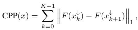
The standard way to evaluate XAI methods is to mask (remove) the most “important” features and see how much the model’s prediction changes. The logic is sound: if a feature is important, removing it should break the prediction.
However, the authors identified a critical flaw. Existing metrics often remove the top \(K\) features simultaneously.
Imagine a scenario where Feature A increases the prediction score by +5, and Feature B decreases it by -5. Both are highly critical features. However, if an attribution method identifies both as important and we remove them at the same time, the net change to the prediction might be zero (\(+5 - 5 = 0\)).
The evaluation metric would look at this zero change and conclude, “Removing these features did nothing; therefore, the XAI method failed to find the important parts.”
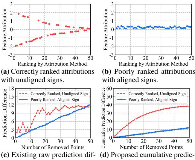
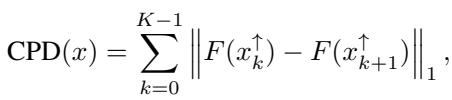
As shown in Figure 1 above, this creates a bias.
- Plot (a) & (c): A “perfect” method (Red) correctly identifies positive and negative features. But because their effects cancel out when removed together, the “Raw Prediction Difference” (Plot c) stays low.
- Plot (b) & (d): A “poor” method (Blue) just guesses features with the same sign (aligned). When removed, their effects add up, causing a steady change in prediction.
Standard metrics punish the correct method (Red) and reward the biased method (Blue). This suggests that much of the recent literature might be optimizing for the wrong goal—aligning signs rather than finding true importance.
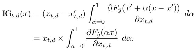
A New Standard: CPD and CPP
To fix the cancellation trap, the researchers propose two new metrics that respect the complexity of model decision-making.
Cumulative Prediction Difference (CPD)
Instead of ripping out all top features at once, CPD removes them sequentially (one by one or in small groups) and sums up the absolute change in prediction at each step.
If Feature A (+5) is removed, the prediction drops by 5. Change = 5. Then Feature B (-5) is removed, the prediction jumps back up by 5. Change = 5. Total CPD = 10.
This metric correctly rewards methods that identify any impactful feature, regardless of direction.
By summing the norms of the difference between consecutive steps (\(x_k\) to \(x_{k+1}\)), CPD ensures that positive and negative contributions are both counted towards the score, rather than canceling each other out.
Cumulative Prediction Preservation (CPP)
While CPD focuses on the most important features (High Attribution), CPP focuses on the least important features. It sequentially removes points with the lowest attribution scores.
The logic here is: “If you say these features are unimportant, removing them shouldn’t change the prediction much.” A lower CPP score is better, indicating the model is stable when “useless” features are removed.
With these faithful metrics in place, the authors re-evaluated existing methods and found that Integrated Gradients (IG)—a classical gradient-based method—actually performs much better than recently proposed state-of-the-art methods. However, naive IG still has major issues with time series data, which leads us to the core contribution of the paper: TIMING.
TIMING: Temporality-Aware Integrated Gradients
Integrated Gradients (IG) is a theoretically sound method that calculates attribution by accumulating gradients along a path from a “baseline” (usually a zero vector) to the actual input.
The formula above essentially says: take the difference between the input and the baseline, and multiply it by the average gradient computed along a straight line between them.
Why Standard IG Fails on Time Series
Directly applying IG to time series (\(x' = 0\)) has two main drawbacks:
- Breaking Temporal Dependencies: Scaling a time series linearly from 0 to \(x\) (e.g., \(0.1x, 0.2x, ...\)) preserves the shape of the series perfectly. The relative values between time step \(t\) and \(t+1\) never change. This means the gradients never see what happens when temporal relationships are disrupted, which is often where the “meaning” of a time series lies.
- Out-of-Distribution (OOD) Samples: The intermediate points on the straight-line path (like a time series with all values at 10% magnitude) might look nothing like real data. The model may behave erratically on these nonsensical inputs, producing unreliable gradients.
The Solution: Segment-Based Random Masking
TIMING (Time Series Integrated Gradients) modifies the integration path. Instead of scaling the whole series from 0, it uses a stochastic baseline.
It creates intermediate points by masking out parts of the real input. But here is the key innovation: it doesn’t just drop random individual points (which would look like static noise). It drops segments of time.
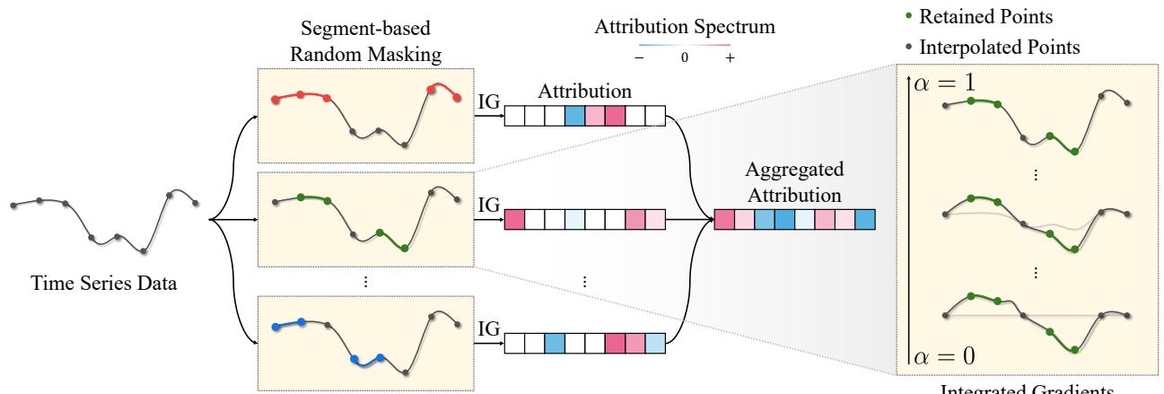
As illustrated in Figure 2, the process works as follows:
- Segment-based Random Masking: The algorithm generates random masks that hide contiguous chunks (segments) of the time series. This mimics missing data or disrupted temporal patterns.
- Path Generation: Instead of a single straight line from zero, TIMING considers paths from these masked baselines.
- Aggregation: It runs this process multiple times with different random masks and aggregates the attributions.
The mathematical formulation for the random masking path looks like this:

Here, \(M\) is the binary mask. The path interpolates between a masked version of \(x\) and the full \(x\). This ensures that the intermediate points (\(x'\)) are structurally similar to the original data, mitigating the OOD problem.
Finally, TIMING calculates the expectation (average) of these masked Integrated Gradients over a distribution of masks \(G\) that generates segments of length \(s_{min}\) to \(s_{max}\):
This approach satisfies the theoretical axioms of sensitivity and invariance, ensuring that the explanations are mathematically rigorous while being tailored to the sequential nature of the data.
Experiments and Results
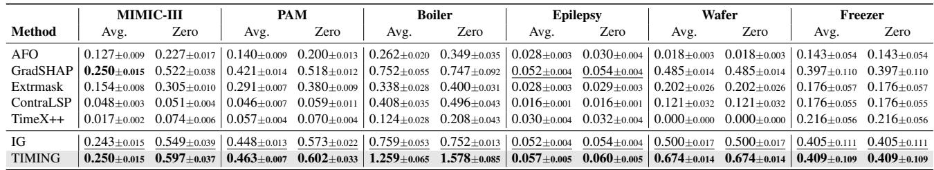
The authors validated TIMING against 13 baseline methods using both synthetic and real-world datasets. The real-world datasets included MIMIC-III (mortality prediction), PAM (activity monitoring), and others.
Quantitative Performance
Using the new, faithful CPD metric, TIMING demonstrated superior performance.
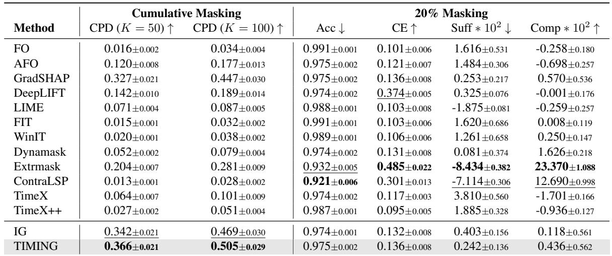
In Table 2, looking at the CPD (K=50) column (higher is better), TIMING achieves 0.366, outperforming the standard IG (0.342) and significantly beating recent methods like ContraLSP (0.013) and TimeX++ (0.027).
Wait, why do the “state-of-the-art” methods like ContraLSP score so low on CPD? It goes back to the cancellation problem. Those methods are essentially optimizing for the old metrics (like Accuracy drop) by aligning signs, but they fail to capture the true magnitude of influence when positive and negative features are summed step-by-step.
The “Unimportant” Features
We can also look at the CPP metric (Cumulative Prediction Preservation). Remember, here we are removing the features the method thinks are least important. We want the prediction to stay stable (low curve).
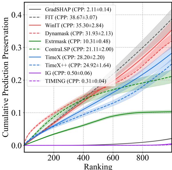
In Figure 3, the graph shows the cumulative change in prediction as we remove “unimportant” points.
- The TIMING line (purple, though labeled in the legend) and IG line are extremely low and flat. This means when TIMING says a feature is unimportant, removing it truly has almost zero effect.
- In contrast, methods like Extrmask or TimeX show a steep rise. This implies they are misclassifying important features as unimportant; when you remove them, the prediction changes drastically.
Consistency Across Datasets
The success wasn’t limited to one dataset. Table 3 shows TIMING winning across various domains, from Boiler fault detection to Wafer manufacturing.
Computational Efficiency
A common concern with “ensemble” or “sampling” methods like TIMING is speed. If you have to run IG multiple times with different masks, isn’t it slow?
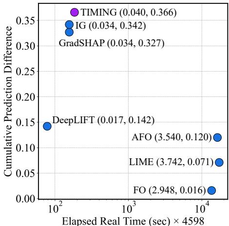
Figure 4 plots Efficiency (x-axis, logarithmic time) vs. Performance (y-axis, CPD).
- TIMING (top left cluster) occupies the “sweet spot.” It has the highest CPD score.
- Its runtime is comparable to GradSHAP and IG, and orders of magnitude faster than perturbation-based methods like LIME or AFO (which are far to the right). By utilizing an efficient sampling strategy during the integration path, TIMING adds minimal overhead to standard IG.
Qualitative Analysis: Does it make sense?
Finally, do the explanations align with human domain knowledge? The authors analyzed the MIMIC-III data (ICU mortality).
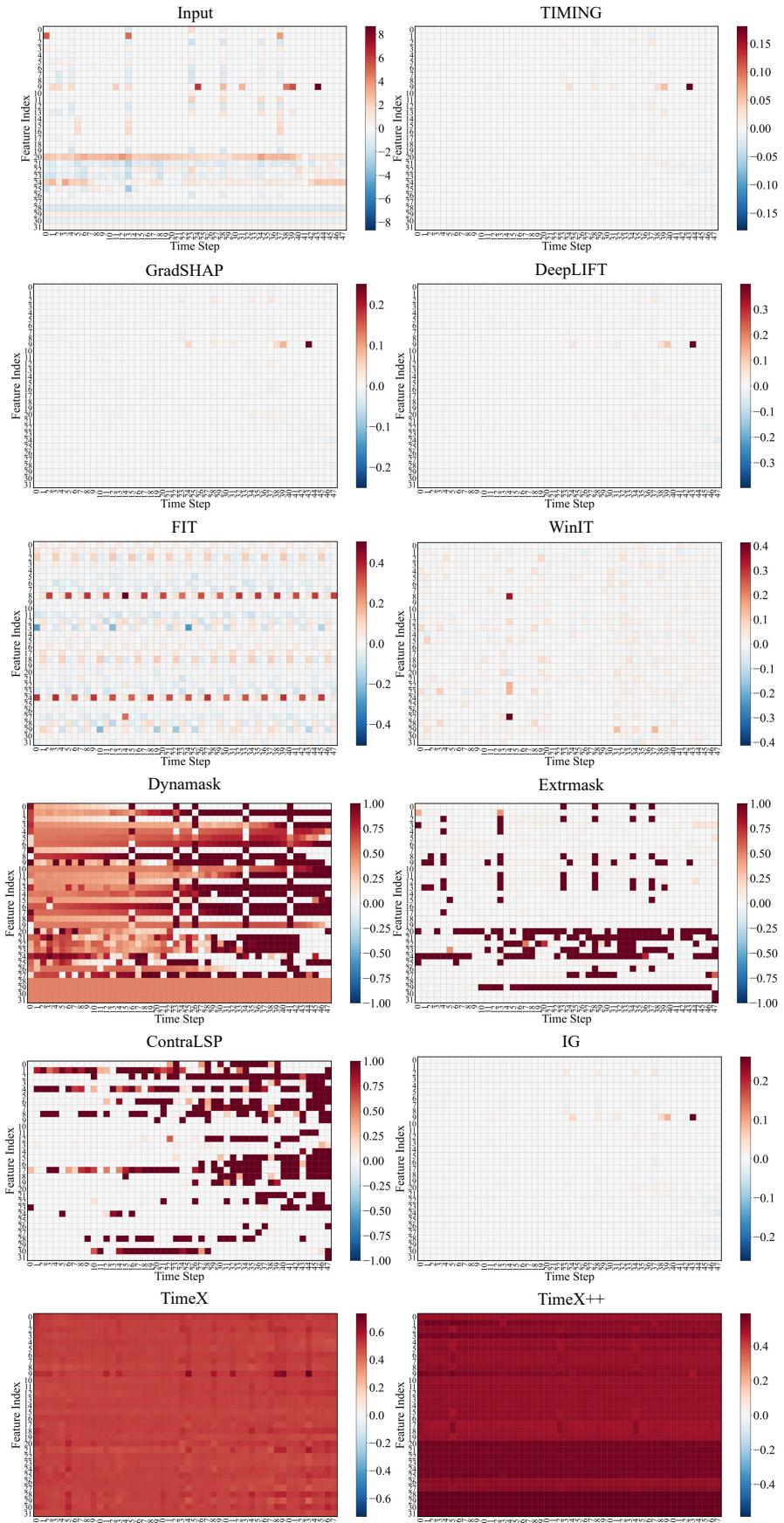
In Figure 10, we see a heatmap of attributions. The TIMING row shows sparse, distinct red (positive) and blue (negative) signals. Specifically, it highlights Feature Index 9 (Lactate levels). Clinical literature confirms that elevated lactate is a strong predictor of mortality (lactic acidosis).
Unsigned methods (like TimeX++) tend to smear importance across the whole time series, making it hard for a clinician to pinpoint exactly when and what went wrong. TIMING provides a clean, clinically relevant signal.
Conclusion
The paper “TIMING” offers two major contributions to the field of Time Series XAI:
- A Correction of Metrics: It exposes how current evaluation standards accidentally punish methods that correctly identify opposing feature contributions. By introducing CPD and CPP, the authors provide a fairer way to benchmark faithfulness.
- A Better Method: By adapting Integrated Gradients with segment-based stochastic masking, TIMING captures the temporal dependencies of time series data without sacrificing theoretical rigor.
For students and practitioners, the takeaway is clear: when working with time series, “importance” is not a scalar value. Direction matters. And when evaluating your models, ensure your metrics aren’t cancelling out the very insights you are trying to find. TIMING represents a significant step toward transparent, reliable AI in safety-critical domains.